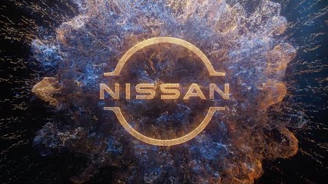
Elon Musk’s Tesla forced a new era of auto manufacturing, demanding modernized changes from brands seen worldwide. BMW, Volkswagen, and Mini have all updated their image through rebranding over the last two years. It’s been announced that Nissan will join that list & enhance their brand with an updated logo. This logo will extend its colour-schemes, moving from a metallic to a matte finish. Nissan hopes that their modernized image will unfold higher profits over the next decades.
Alterations into the design of the logo are minimal, with the 3D element being terminated & altered into the 2D structure. Nissan’s company name remains located in the centre, with widened lines shorted to characterize the simplification of their brand. Fonts used for the Nissan name are stretched prior it’s prior iteration, symbolizing their heritage over three decades. Combining their logos updated attributes creating a modern aesthetic, representative of Nissan’s growth in the Electric Vehicle Market.
Nissan’s updated logo arrives 1st with the “Ariya SUV”, which is entirely electric & meant to compete against Tesla’s Sports Utility Vehicle directly. Differentiating factors for their enhanced logo goes beyond its physical design, with the electrical component of Ariya supporting illumination behind Nissan’s name. Twenty LED Lights will showcase the Nissan logo in 10+ thousand colour options.
Media personnel at Nissan confirmed that their updated logo was 1st proposed in 2017. It’s taken three years to create by Senior Vice President of Global Design, Alfonso Albaisa. Multiple iterations were released to company personnel & requested for opinion. Constructive criticism for Alfonso indicated that simplicity with modernity would highlight what’s to come with Nissan. It should be mentioned that Alfonso Albaisa received design assistance from Tsutomu Matsuo and his team of artists. The three critical points behind their design project included “Thin, Light, and Flexible”.
The Logos History
It’s been two decades since Nissan last changed their branding identity, which saw their former logo during the 1990s switched over into the third-dimensional formation. After twenty years Nissan would unveil a 2D Logo, similar to their initial design before the 2000s. Consumers can anticipate their updated image to sustain a lifespan of ten to twenty years under historical averages.